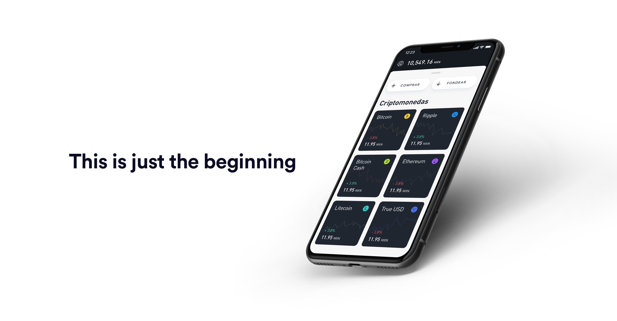
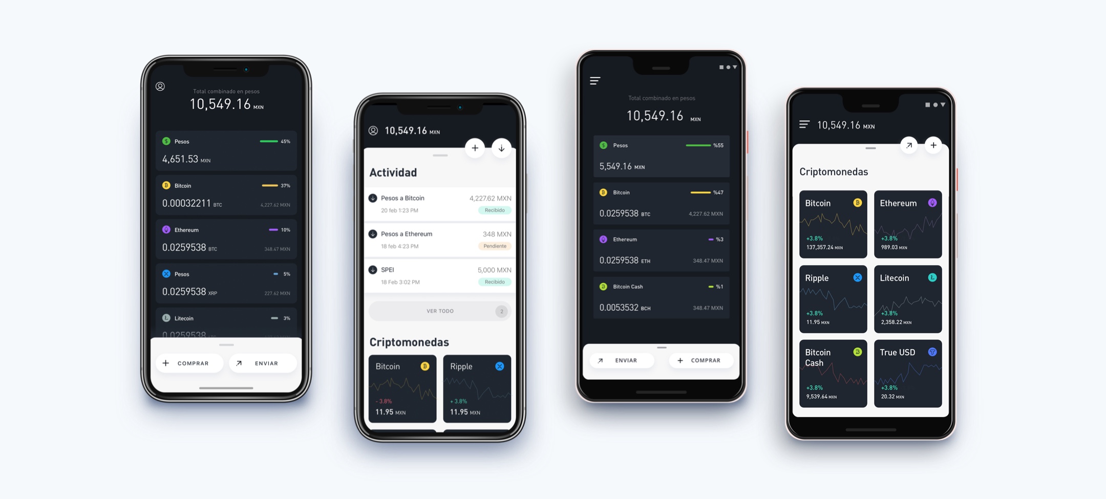
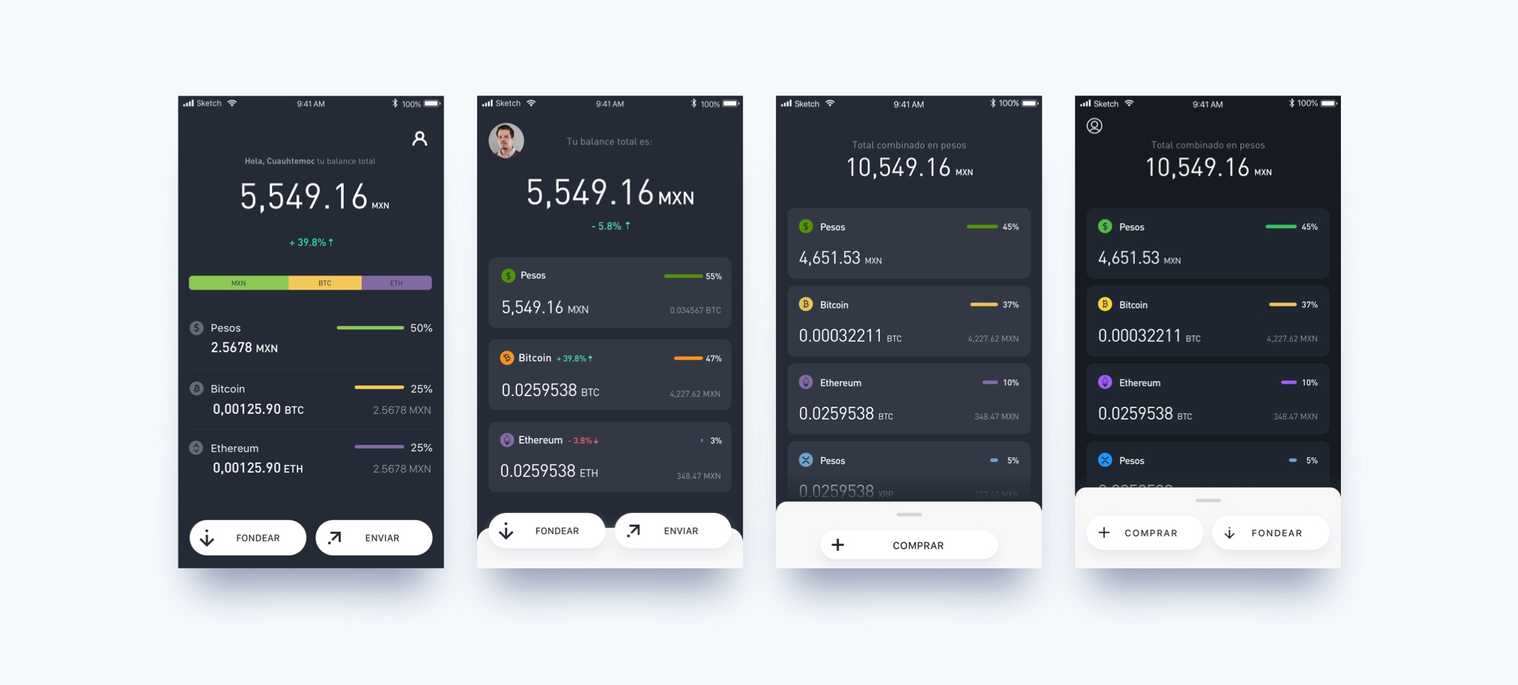
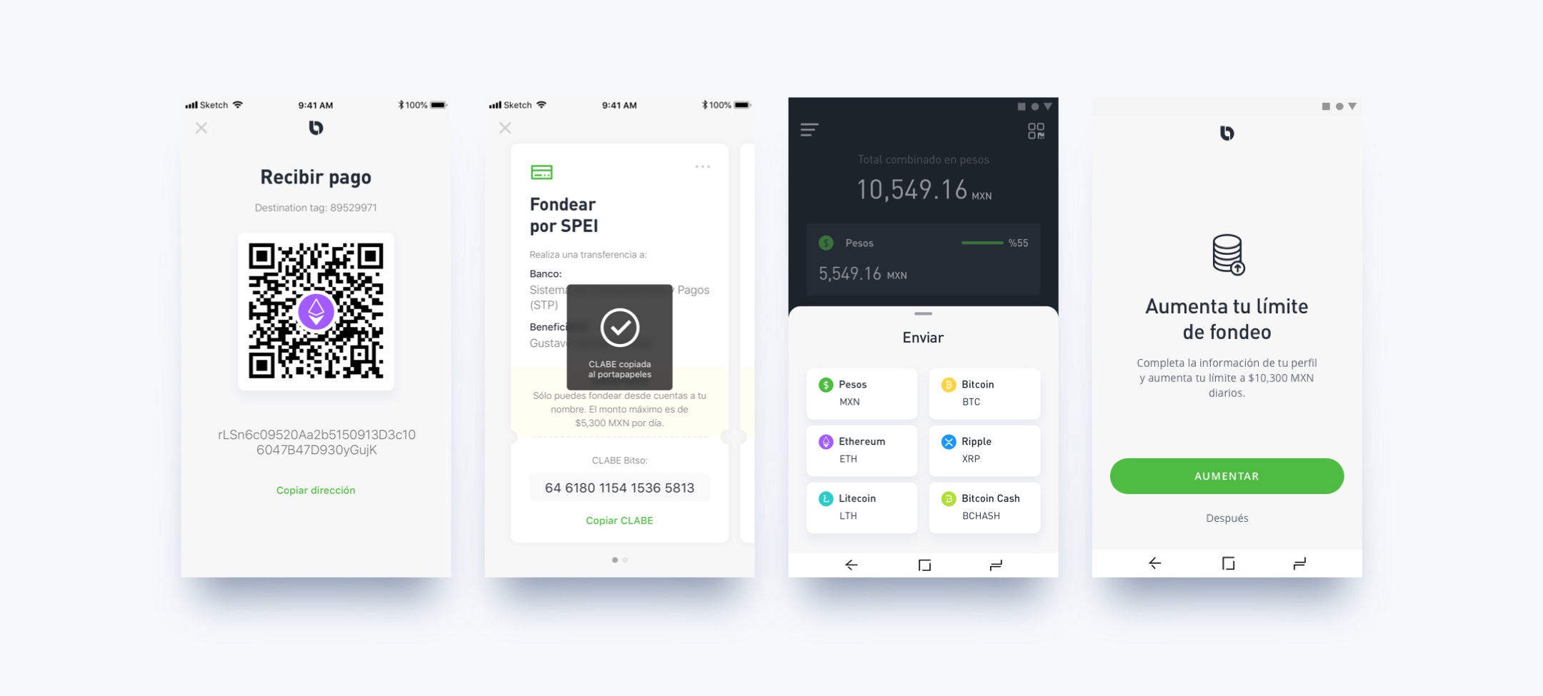
The Bitso iteration process: countless hand sketches, more than 600 interfaces, and the search for the maximum simplification.
Designing Bitso
Scaling-up the leading crypto exchange platform in Latin America
Discipline
Product Design
Year
2018
Industry
Fintech
Our Contribution
User Research
Product Strategy
Product Design
User Experience Design
Interface and Interaction Design
UX Writing
Prototyping
Marketing Strategy
Crypto in Mexico
When the conversation about cryptocurrencies started in Latin America, Bitso took the leading voice. The company started operations in April 2014, with the mission of reinventing financial services in Mexico through incorporating blockchain and crypto.
After four years of operations, Bitso was ready to launch new services to continue generating an impact on the creation of the new digital economy in Mexico and driving financial inclusion for the people of the country.
Today, Bitso has around 600,000 users and more than 60% market share. However, crypto is still perceived as not accessible and difficult to understand.
Source: “En México hay 800,000 usuarios de activos virtuales, según datos de Bitso”.
El Economista. February 4th, 2019.
To change this mindset and fulfill the mission of democratizing crypto, 23 Design and Bitso started collaborating in order to better understand its users; rethink its strategy for non-expert users, reframe the architecture of the app, and give a visual refresh to the interface and website.
Finding the path for growth
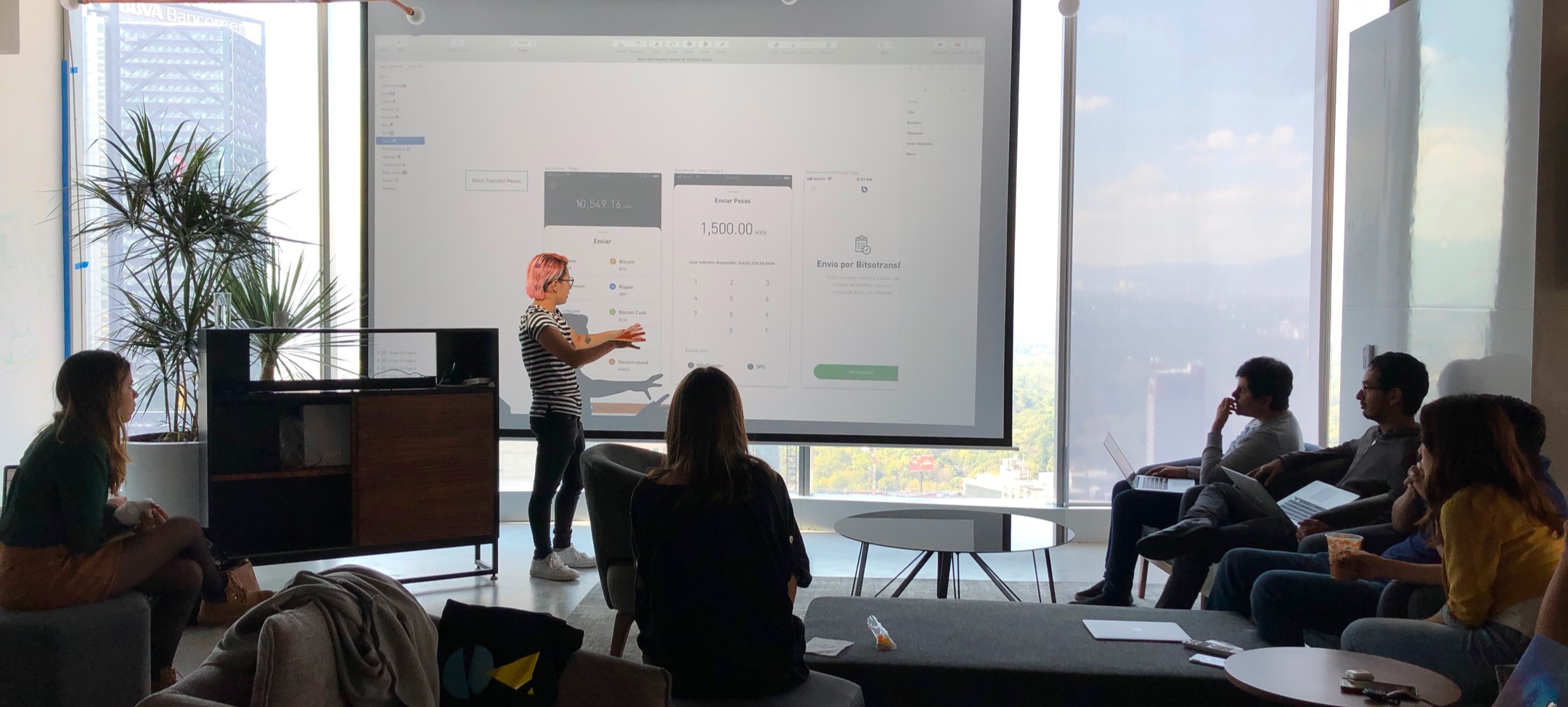
How to attract new users, especially those who are not experts, to scale-up?
We needed to switch the mindset about crypto being only for experts. By working together, Bitso increased their innovation capabilities. We empowered the team with strategists, designers, and other specialists to launch a new app in record time.
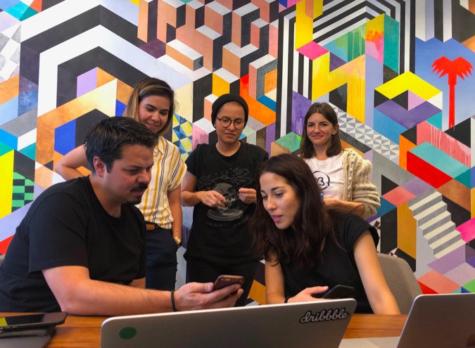
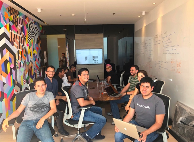
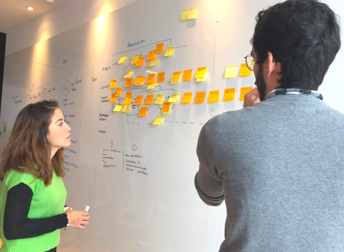
We realized that the key to increasing the adoption of cryptocurrencies was to simplifying it to the point of making it enjoyable and part of people's daily lives.
As a consequence, we decided to priotirize designing for new users, rather than current - more expert - users, and create opportunities for most, rather than the few innovators and early adopters already on the platform.
After eight months of intense collaboration, we demonstrated how an external team can work to understand people, their motivations, needs, and fears.
To redesign the Bitso’s platform we had to rethink the architecture and experience by carrying deep research and not only renovating the appearance.
“We iterated every screen and every feature in order to see what worked and made sense to all kinds of users. We decided to focus on the main tasks: buy, fund and send crypto; and, of course, to see the balance of your portfolio.”
Jay Lopez
Product Designer, 23 Design
Outcome
hundreds of thousands
new accounts created since launch
more than half a million
active users
+ 600
interfaces
2
apps
7
months to launch
increase
use of BitsoTransfer
increase
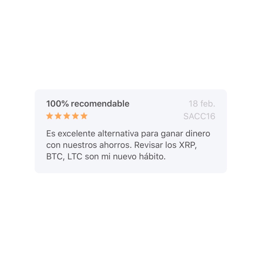
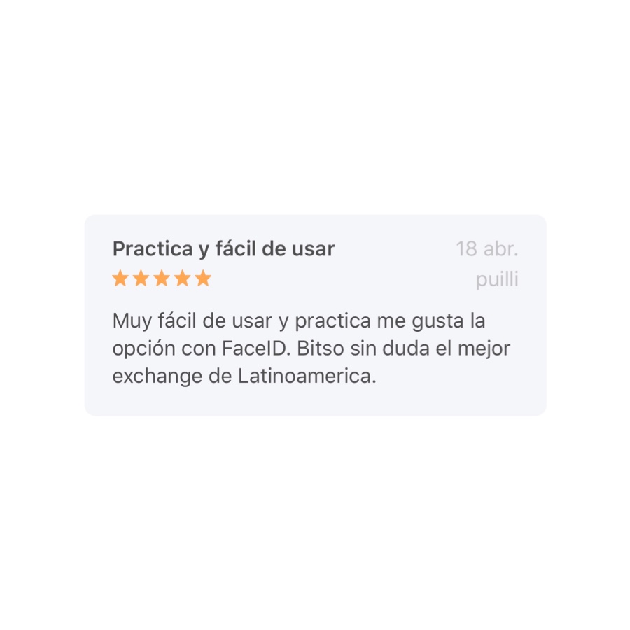
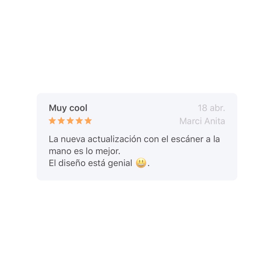
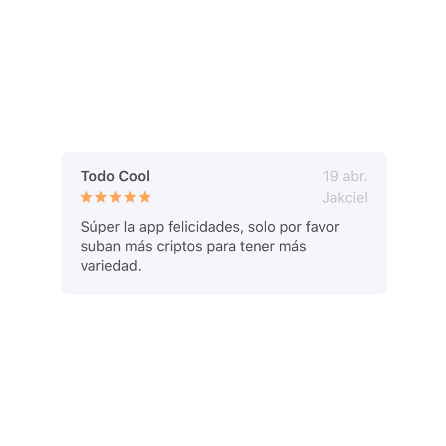
positive reviews
increase
fundings in Bitso accounts
“Perfection is achieved not when there is nothing more to add, but when there is nothing left to take away.”
Antoine de Saint-Exupéry
This collaborative work led us to live a design process full of useful learnings. We questioned the existing mental models, we iterated countless of times the user interfaces, we ran findability and discoverability tests and we validated hypothesis with all kinds of prototypes, all with the sole purpose of simplifying the crypto experience as much as possible.
Our mission was to create an experience so simple that users felt they were experts, and so easy that they would not needed to be.
To achieve this, we eliminated everything that was a left over or added complexity in the experience.
Proof of this is the process of buying crypto. By understanding people’s motivations, needs, and fears, and mental models, we were able to simplify the process of buying crypto (shown in the left) to just four steps.
We also focused on rewarding moments like sending and buying with animations to create a 'Wow moment' that would thrill users when buying crypto and at the same time make it less abstract.
We tirelessly iterated everything to the last detail, to the visual elements on the UI, to the weight and feel of the coins
Bitcoin
Ethereum
Litecoin
Business Impact
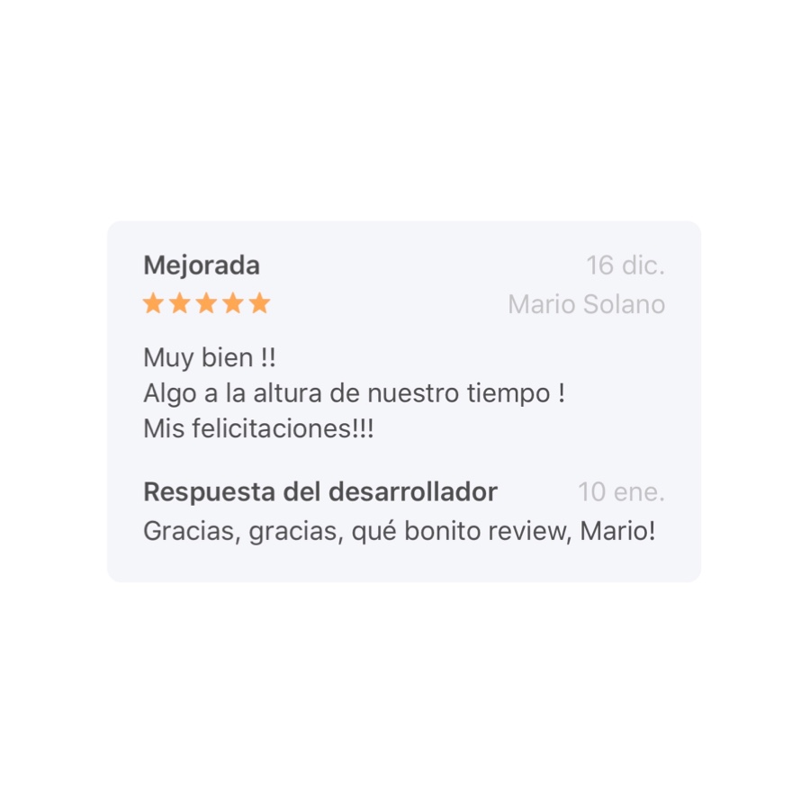
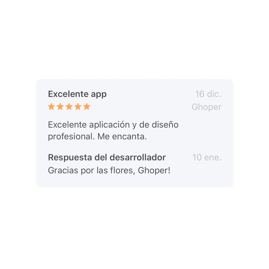
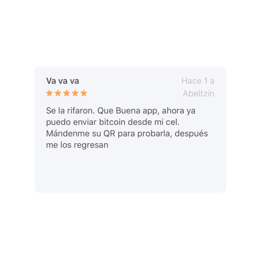
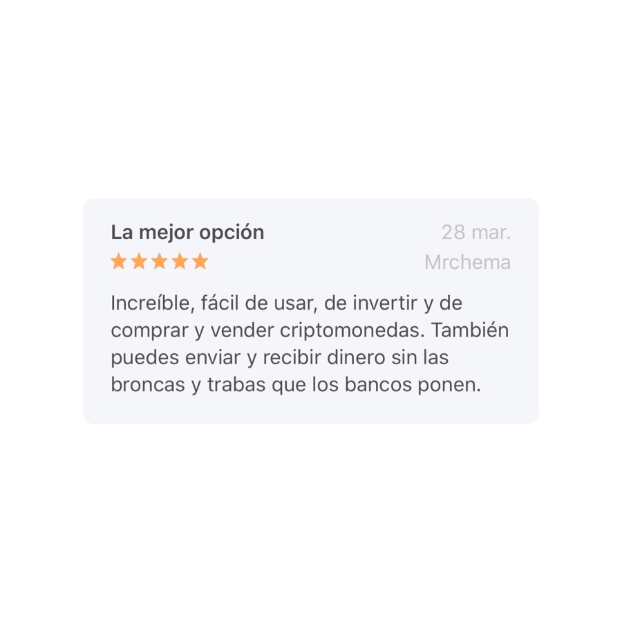
The new apps radically impacted the use of Bitso and Bitso Transfer and the creation of new accounts and purchases from iOS and Android.
These outcomes are the result of teamwork, collaboration, active listening and a project with a great mission: democratizing access to investment assets and financial services, with an accessible and easy to adopt product.
We keep working on new features and simplified functionality to keep improving and delivering value to Bito's users. Stay tuned for more.
